How to Build a Strong Brand Identity for Your Online Store
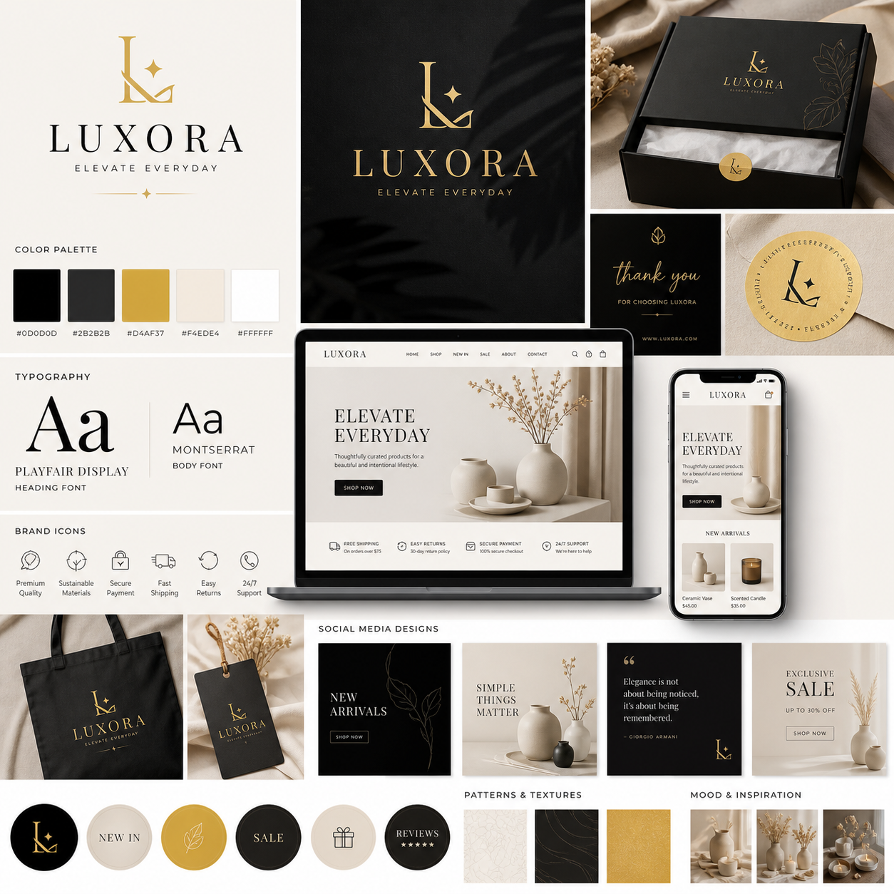
A strong brand identity helps an online store become recognizable, credible, and easier to remember. It shapes how customers experience your business from the first social media impression to the product unboxing, while giving your marketing and ecommerce decisions a clear direction.
What Is an Ecommerce Brand Identity?
An ecommerce brand identity is the deliberate system of visual, verbal, and experiential elements that represents an online store. It includes your logo, color palette, typography, brand voice, messaging, packaging, and customer experience.
Brand identity is what your business creates and controls. Brand image is what customers believe and feel about your business after interacting with it. The two are connected, but they are not identical. You can design a warm, premium identity, for example, while customers may see the store as expensive or inaccessible if product quality and service do not support that promise.
For an online store, identity matters because customers often encounter the business in fragmented moments: a search result, an Instagram post, a product page, an abandoned-cart email, or a delivery box. Consistent design and language connect those moments into one recognizable experience.
- Recognition: Customers can identify your store across channels.
- Trust: Consistent presentation signals care, stability, and professionalism.
- Differentiation: A clear identity gives customers a reason to choose you over similar alternatives.
- Customer experience: Brand expectations become visible in navigation, product information, checkout, support, and delivery.
Branding cannot compensate for poor products, confusing navigation, slow shipping, or weak customer support. Treat identity as the connective layer around a good ecommerce operation, not a replacement for one.
Define Your Target Audience and Brand Positioning
To define brand positioning, identify your most valuable target audience, understand its priorities, and state why your store is a better fit than the available alternatives. This decision should guide every later choice, from typography to promotional language.
Begin with a practical customer profile rather than a broad label such as “online shoppers.” Document the customer’s situation, motivations, objections, budget, preferred buying channels, and expectations after purchase. Review customer reviews, support conversations, search queries, competitor websites, and product returns for evidence.
Use the “customer, problem, promise” framework
- Customer: Who is most likely to value your offer?
- Problem: What frustration, desire, or task brings them to your store?
- Promise: What specific outcome can your business provide, and why should customers believe you?
For example, a sustainable home-goods store might serve renters who want attractive, lower-waste products without complicated lifestyle changes. Its positioning could focus on practical swaps, transparent sourcing, and approachable education. That is more useful than simply describing the store as “eco-friendly.”
Map three to five competitors and note their product range, price level, visual style, claims, shipping policy, and customer reviews. Look for an underserved position. You might compete through specialist knowledge, simpler product selection, faster fulfillment, inclusive sizing, or unusually clear buying guidance.
Write a short positioning statement: For [target customer], [store] is the [category or solution] that provides [distinctive benefit] because [reason to believe]. Keep it internal if it sounds too formal for customers. Its purpose is to create focus, especially when deciding which products, partnerships, and campaigns fit the brand.
Develop Your Brand Personality, Voice, and Messaging
Brand personality describes how your store would behave as a person, while brand voice defines how it communicates consistently. Together, they turn brand values into recognizable language across product pages, email marketing, social media, and customer support.
Choose three or four personality traits that customers can actually observe. “Helpful, candid, and energetic” is more actionable than “excellent.” Then define the boundaries of each trait:
- Helpful: Explain choices and offer practical guidance; avoid unnecessary jargon.
- Candid: State limitations, materials, delivery times, and care requirements clearly.
- Energetic: Use active verbs and confident invitations without excessive exclamation marks.
Next, establish your core messages. Most online stores need a concise value proposition, a product benefit message, proof points, and reassurance about risk. Proof may include certifications, material details, customer reviews, guarantees, founder expertise, or transparent policies. Claims should be accurate and easy to verify.
Build a tone matrix for real customer moments
Your voice stays stable, but tone can change with the situation. A launch announcement may sound enthusiastic; a delayed-order email should sound direct, accountable, and calm. Create examples for product descriptions, checkout notices, customer complaints, and post-purchase messages.
Use the same terminology for product features, shipping options, sizes, and guarantees. Consistency reduces cognitive friction. A customer should not see “dispatch,” “ship,” and “send out” used for three different stages unless those stages truly differ.
Create a Memorable Visual Identity
A memorable visual identity combines a usable logo, purposeful color palette, readable typography, consistent imagery, and supporting design elements. The system should reflect your positioning while remaining accessible on small mobile screens.
Start with the logo, but keep its role in proportion. A logo identifies the store; the broader visual identity creates recognition. Prepare versions for a website header, mobile display, social avatar, packaging label, and dark or light backgrounds. Test it at small sizes before approving it. Fine details that look attractive on a large screen may disappear in a browser tab or shipping sticker.
Select a primary color, supporting colors, neutral tones, and clear usage rules. Color can create associations, but it does not guarantee a particular emotion or sales result. Check contrast for text and interface controls using accessibility tools and the [Web Content Accessibility Guidelines](https://www.w3.org/WAI/standards-guidelines/wcag/). Choosing a fashionable palette may create short-term appeal while reducing readability or aging quickly.
Typography should support the shopping task. Use one typeface family for most stores, or pair two with distinct roles. Define heading, body, button, label, and price treatments. Body text needs comfortable spacing and sufficient size on mobile devices; decorative lettering belongs in limited display contexts.
Set image rules as well. Decide whether product photography uses a consistent background, how lifestyle images are cropped, which filters are avoided, and how illustrations or icons appear. A premium identity may use restrained compositions and detailed close-ups, while a playful children’s store may use brighter scenes and expressive shapes. Neither approach works without consistency.
Apply Your Brand Consistently Across the Online Store
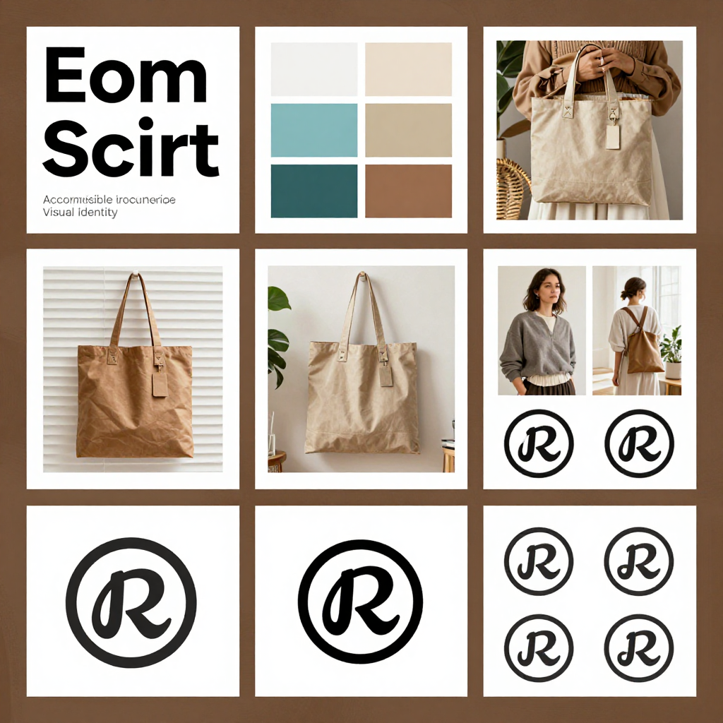
Apply brand identity at every customer touchpoint, including the storefront, product pages, checkout, email, social media, packaging, and support. Consistency means the experience feels related and predictable, not that every channel contains identical content.
Audit the shopping journey in order: discovery, consideration, purchase, delivery, and retention. At each stage, ask whether the customer sees the same promise and receives the information needed to proceed.
- Homepage: State who the store serves, what it offers, and why it is credible within the first screen or two.
- Navigation: Use familiar categories and labels that match customer language.
- Product pages: Combine brand voice with accurate specifications, benefits, photography, reviews, delivery details, and care instructions.
- Checkout: Keep reassurance visible, explain costs early, and avoid promotional language that distracts from completion.
- Email marketing: Use repeatable templates, recognizable sender details, and a tone appropriate to each message.
- Social media: Adapt the format while preserving visual cues, vocabulary, and point of view.
- Packaging: Carry the identity into labels, inserts, tissue paper, and returns information without adding waste unnecessarily.
- Customer support: Train representatives to use the same terminology and service standards as the website.
Run a consistency audit by collecting screenshots from five customer touchpoints. Remove the logos and compare the remaining colors, type, imagery, and language. If the store still feels like one business, the system is doing its job. If not, fix the highest-traffic surfaces first.
Build a Brand Style Guide and Refine It Over Time
A brand style guide documents the visual, verbal, and operational rules that keep an online store consistent as more people and channels become involved. A useful guide can begin as a 10-page document; it does not need to become a large corporate manual.
Include these essential sections
- Brand purpose, values, target audience, and positioning statement.
- Logo files, clear-space rules, minimum size, and incorrect-use examples.
- Color values for digital and print use, plus accessible contrast combinations.
- Typography hierarchy, sizing guidance, and approved alternatives.
- Photography, illustration, icon, layout, and cropping principles.
- Brand personality, voice, tone matrix, preferred terms, and words to avoid.
- Examples for product pages, promotional emails, social captions, support replies, and packaging.
Assign one person to approve changes, even if several people create content. Store the guide where contributors can find current files, and label outdated assets clearly. A guide that nobody uses is decoration, so connect it to onboarding, campaign briefs, product launches, and quality checks.
Review the identity quarterly using customer feedback, search behavior, conversion paths, support questions, and accessibility checks. Update unclear language or weak interface patterns first. A larger redesign may make sense when the target audience, product category, business model, or market position changes. Avoid changing the logo and colors simply because a trend has moved on.
Common brand identity mistakes to avoid
- Designing around personal taste: Store owners often choose what they like rather than what supports the target audience and positioning. Test decisions against customer needs and usability.
- Overpromising in the messaging: Grand claims create expectations that product quality or fulfillment may not meet. Replace vague superlatives with specific evidence.
- Ignoring mobile and accessibility: Beautiful desktop designs can fail on small screens or create unreadable contrast. Test real pages on phones and with accessibility tools.
- Changing the identity too frequently: Constant revisions prevent recognition and create extra production work. Keep the core system stable while improving individual applications.
Frequently Asked Questions
What is the difference between a logo and a brand identity?
A logo is a recognizable graphic mark. Brand identity is the larger system that includes the logo, visual design, brand voice, messaging, customer experience, packaging, and other signals associated with the store.
How much does it cost to create a brand identity for an online store?
Costs range from using carefully selected templates and internal work to hiring a professional designer or agency. A small store can begin with a focused logo system, color palette, typography, messaging, and style guide, then invest in research and custom design as revenue and complexity grow.
What should an ecommerce brand style guide include?
It should include positioning, audience, brand values, logo rules, colors, typography, imagery, voice, tone, approved terminology, accessibility guidance, and examples for major ecommerce touchpoints.
How can a small online store build a professional brand?
Define a narrow audience and clear promise, use a limited design system, write specific product information, standardize templates, and apply the same rules to the website, email, social media, packaging, and customer support.
How often should a brand identity be updated?
Review it regularly, such as quarterly, but make major changes only when customer needs, positioning, product direction, or business goals have materially changed. Small usability improvements can happen without replacing the entire identity.
A strong online-store brand grows from alignment: the right customer, a credible promise, a distinctive voice, a usable visual identity, and reliable execution after the sale. Document those choices, apply them consistently, and let customer evidence guide the next refinement.